
 Have you ever spent weeks planning a road trip down to the last detail, only to be surprised along the way? The longer the trip, the higher the likelihood that something unexpected will happen. What does this have to do with microservices visualization? Great question! (I’m wondering that too!).
Implementing microservices can be a challenge because they’re inherently distributed which makes it hard to understand their relationships and dependencies from inception to deprecation. Event-driven microservices make this even harder to manage in that their biggest strength of decoupling is also their biggest challenge.
More event-driven microservices means more change, more dependencies, more moving pieces. Event sources don’t know about event sinks, so without a way to visualize the dependencies and interactions between microservices, your architecture starts to look like an Allstate Mayhem Commercial. Which leads me back to my road trip analogy (did you think I forgot?). For a super simple trip, you could get out your old Rand McNally Road Atlas (did I just date myself?) and highlight your intended route. What could go wrong? Road trip to San Diego for a beach vacation? Pack your swim trunks and let’s go!
But the problem is, I don’t live in San Diego, or in California for that matter. Coming from Salt Lake City where I live, I must drive across a couple states and through a number of towns like Provo, Las Vegas and Los Angeles to get there. And it’s not just one street I need to drive on, but many interstate highways, state roads, and local roadways. To make it more complicated, there are many different options that get me to San Diego too! So what am I getting at with this analogy? All of these cities are like microservices; they’re all related because they touch each other and flow into each other through roads. The roads are constantly changing from initial construction, to enhancements, to ultimate deprecation. Turns out route 66 is pretty much gone, yet my Rand McNally says it’s still there….
The Need for Microservices Visualization
This is what happens with all design documents (microservice or not) that are not updated as things change. In order to visualize the microservices architecture, an architect “sketches” the design in PowerPoint or Visio, takes pretty pictures, uploads them to SharePoint, and it soon becomes as accurate as the atlas in your glove-box. If you took that 1990 Rand McNally Road Atlas you would be up a dusty desert road, without gas, with only your swim trunks, and sitting in 120 degree heat!
So how do you take a road trip today? Google Maps lets you visualize, with multiple layers/views (road, topography, satellite) where you are going, complete with up-to-the-minute traffic and construction information, all verified by the real-time data collected by other users. In other words, the roads are verified, and construction and traffic bottlenecks are exposed so you can go around them. With Google Maps, you can estimate down to the minute when you’ll be cracking open that beer at your final destination, feeling the sand between your toes and working on that sunburn you’ll soon regret.
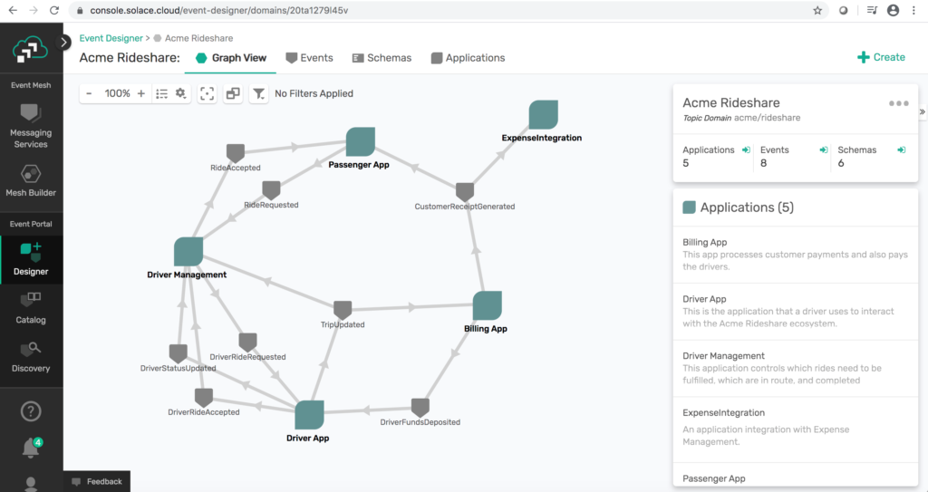
Let’s get back to event-driven microservices. What you need is a visualization tool that lets you map the relationships between your microservices, i.e., what data and schema is transporting your business objects, and lifecycle manage them so you don’t end up with a mess.
Why Most Microservices Visualization Approaches Fail
You might be thinking “Couldn’t I just keep my Visio or PowerPoint diagram up to date, and version control the design document?” If you’re talking about a small organization with infrequent changes, perhaps, but that is not the reality of most organizations I have worked for or with. To stay accurate your map needs to be constantly interrogating the interactions between the microservices and looking for discrepancies. What do I mean by discrepancies?
- Does the data comply with the baseline schema? Does a data change comply with schema compatibility rules (forward, backward, etc.)
- Are microservices sending the right data? To the right topic/place?
- Are microservices consuming/subscribing to all the data they should? Should they be processing more data sets? Are they trying to consume data they are not authorized to receive?
- Are there the proper number of microservice instances running to handle the data load?
These are the discrepancies that have a hard time finding their way back to a Visio, PowerPoint or a Confluence page. They are also the exact problems that plague microservice deployments (and all distributed systems) – if you can’t visualize the microservices architecture, you can’t understand the impact of a change.
Going back to the map example, if you were only looking at a list of directions and deviations, it would be hard to understand the impact of a road closure or traffic congestion and to weigh the pros/cons of the proposed rerouting. Yet, this is but one small example of why you need better tooling to visualize and understand your microservices architecture.
The Keys to Good Microservices Visualization
What all of us really want is to understand not just where we are and where we are going (whether architecting a system or going on a road trip), but how we’re going to get there, and where we are on that journey. To do that we need the following key capabilities:
- Visualizations that give us information about relationships that can be hard to grasp from data alone (e.g. having a visual map in Google vs. written directions)
- Layers/views that enable cognitive understanding without complexity, more than a PowerPoint diagram can (e.g. topography/satellite view in Google Maps)
- A standard way to collaborate (share maps, waypoints, live position)
- An automatic way to catch discrepancies with reality (Google crowdsourcing changes)
- Change management capabilities (Google alerting to traffic, construction, speed traps and rerouting in real-time)
Visualizing Microservices with an Event Portal
An event portal is the key to treating your microservices architecture like you would treat a cross-country road trip – with adequate planning, the proper resources you need to visualize and manage the way forward (including potential hazards, detours), and a way to share it with others it may impact, whether that’s your coworkers, teammates, or your college buddy in Barstow whose couch you’ll crash on for a night.
Solace recently introduced an event portal called PubSub+ Event Portal that lets you:
- Keep your loosely coupled microservices working, and yourselves/teams/managers happy by visualizing their relationships
- Visualize how a change to one microservice is going to impact others
- Proactively alert others before you hurt them
- Ensure each microservice is independently versioned
- Manage event relationships
- And so much more!
This is so important for designing and maintaining microservices architecture because it can help the organization make better, informed decisions and – ultimately – get you to where you need to go.
Conclusion
With all that said, here are some wise words (if I do say so myself) to live by:
Use Google Maps to get where you’re going on the road, not your 1990 Rand McNally Atlas. And use Solace PubSub+ Event Portal to manage and visualize your event-driven microservices, not Visio, PowerPoint, GitHub manifest files, Confluence, etc.
Try out the Solace PubSub+ Event Portal and explore how you can visually design and understand your event-driven microservice topography. Manage your event relationships like you do your road trips: with the best tools at hand!


Subscribe to Our Blog
Get the latest trends, solutions, and insights into the event-driven future every week.
By submitting this form, you agree to Solace’s privacy policy: solace.com/privacy-policy/