After designing and deploying a distributed application onto Solace PubSub+, have you ever wondered what the runtime topic metrics look like? Ever wanted to visualize the topic hierarchy used by applications, to be able to browse which topics were being used the most, and discover if there were any patterns in the data?
As someone who has programmed Solace messaging applications and administered complex Solace infrastructure, I’ve often wondered about the variety and variability of the messages flowing through a Solace environment. Solace has an amazing amount of statistics and metrics available as part of its always-on monitoring, at the system level, within message VPNs, and even down to the client and queue level. PubSub+ event brokers can provide accurate counts of total messages received and sent, by type (e.g. direct vs. guaranteed), and even per-second and per-minute rates. (In case you want to learn more I’ve included at the end of this post some links to places where you can learn more about Solace monitoring, Syslog, SEMP, etc.
However, monitoring of topics is different. That’s because unlike VPNs, queues, and clients, PubSub+ topics are ephemeral, or short-lived, by which I mean they only exist as metadata within messages, and every single published message could have its own topic. With length up to 250 UTF-8 characters, that is a LOT of topics! Monitoring an (almost) infinite number of things indefinitely is hard, and monitoring topics isn’t something you’ve been able to do…until now.
I’m pleased to announce that we’ve added to our recently launched Solace PubSub+ Event Portal product something called the topic discovery explorer. It’s an interactive graphical representation of topics that are being published within a PubSub+ event broker, represented as sunburst or icicle diagrams that I’ll explain below.
Before we take a look at the topic explorer itself, consider this example. Imagine a public transit system…you’ve got buses, trams, and subways moving around the city, communicating with stations, traffic systems, and mobile devices. Here’s what the topic hierarchy for such a system might look like, with the various levels grouped together: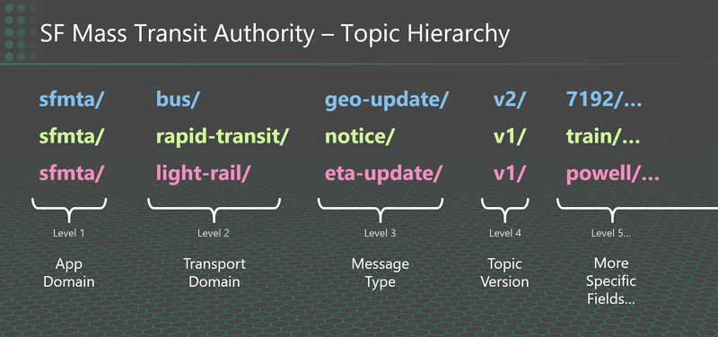
Based on that hierarchy, here’s some examples of specific topics:
- When a tram arrives at a station:
sfmta/ light-rail/ eta-update/ v1/ powell/ 3834/ 5 - Where a bus is currently located:
sfmta/ bus/ geo-update/ v2/ 7192/ 037.8912/ -122.7322 - When a subway needs to be re-routed:
sfmta/ rapid-transit/ notice/ v1/ train/ train-re-route/ 8291
For guidance on how to set up an effective and futureproof topic hierarchy for your use case or domain, to check out these best practices for topic architecture and topic hierarchies.
Now let’s look at how PubSub+ Event Portal’s topic explorer can help you better understand your topic hierarchy and see how it applies to real messages flowing through your system. You can read on, or watch this video.
Topic Discovery Explorer in Action
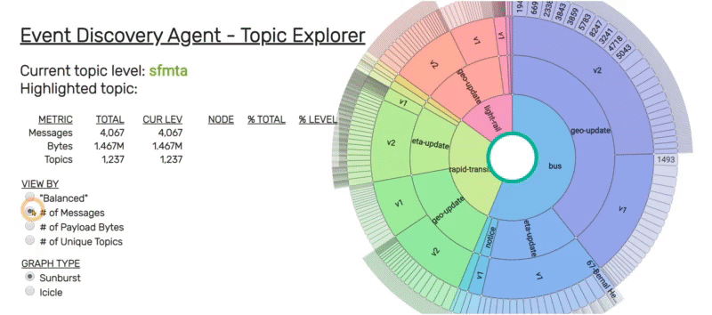
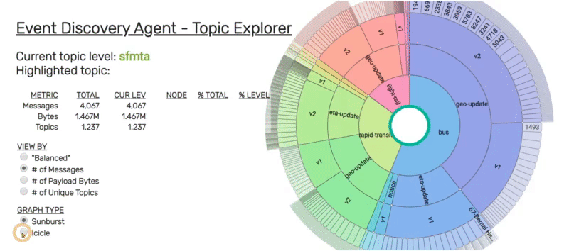
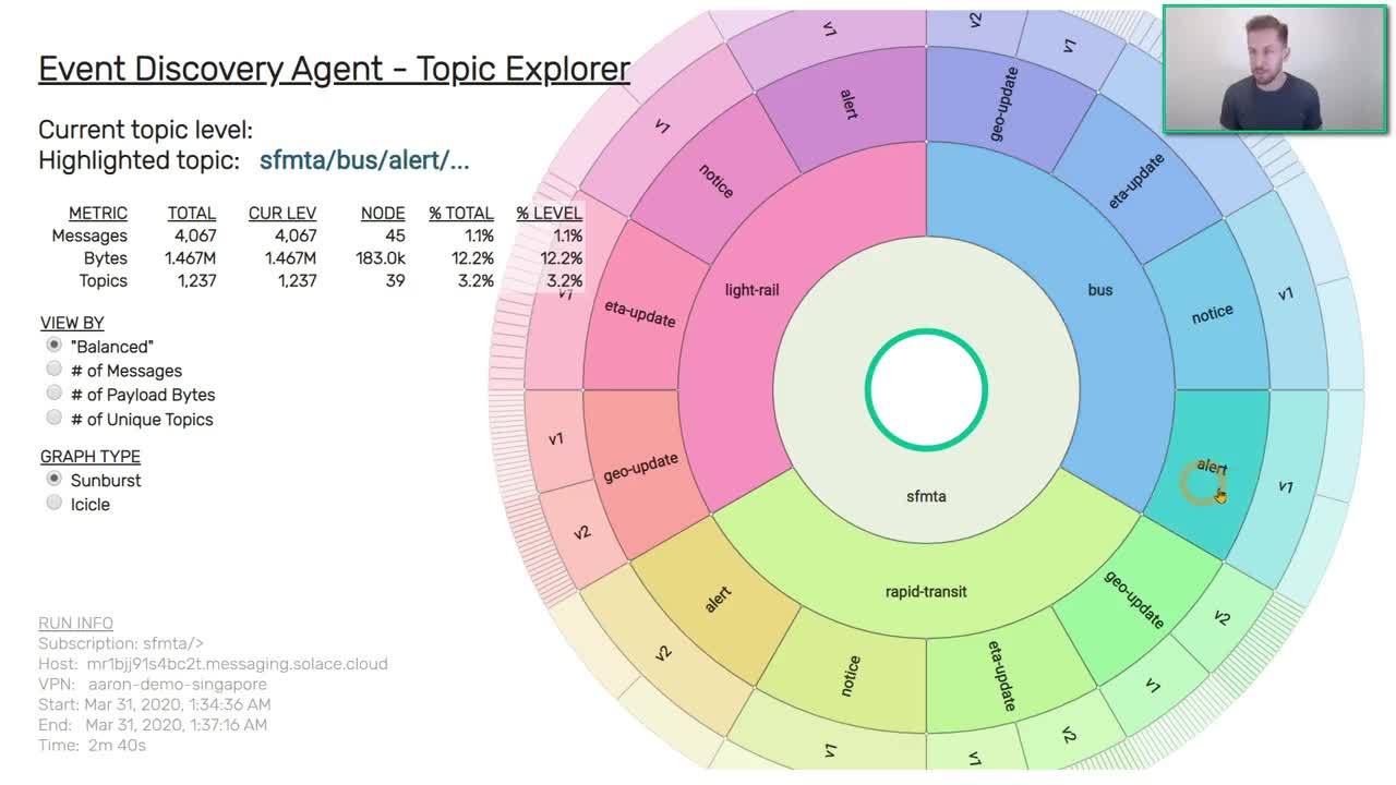
The sunburst diagram of topic explorer makes it easy to see the structure of how a topic hierarchy is created, and it is from these levels that the concentric rings of the sunburst diagram are generated. The root level is at the center, and each ring as you go out represents the next level of the topic hierarchy.
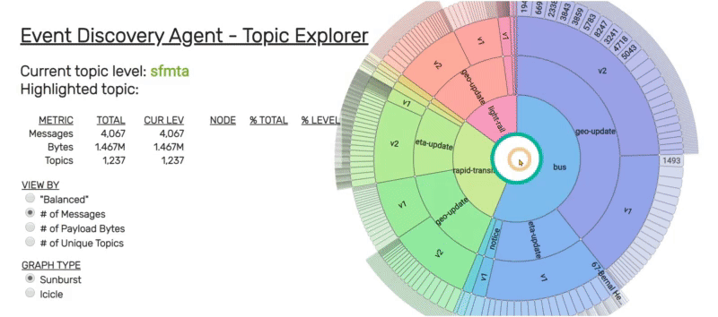
Viewing Topic Data by Metric
Once the data is loaded into the sunburst visualization, you can “mouse around” — hovering over different sections of the diagram will show you metrics as to how many messages were received that start with that particular topic fragment.
Exploring Your Topic Hierarchy
The sunburst diagram draws on actual runtime metrics, and there are four ways you can view your the topic hierarchy:
- By # of messages received (which are the busy topics)
- By payload bytes (which messages consume the most bandwidth),
- By unique topics starting with that prefix
- With a “balanced” view that gives equal weighting to all segments under the same parent node
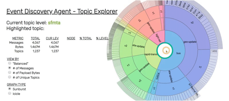
Solace topic hierarchies can be quite deep (up to 125 levels!), but typically range in the 5-9 levels range. Clicking on any of the arc segments will recenter the sunburst diagram with that particular topic prefix at the root, and redraw itself to show all the children nodes/topics under that level. Clicking on the center of the diagram will move you back up one level.
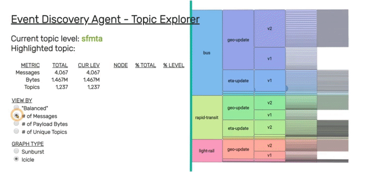
Converting to the Rectangular “Icicle” View
Some people prefer rectangular views of the hierarchical data, rather than circular ones. The Topic Explorer can also visualize the data as an icicle diagram: it is the same data, just read from left-to-right, instead of inside-out.
Using Icicle View
This alternative view should be self-explanatory. Change the “View By” metric, click on topic segments to zoom into that level, and click to the left of the green line to back up to previous level.
Conclusion
To run topic explorer in your own environment, log in to Solace Cloud Console and open PubSub+Event Portal. From there, click on “Event Discovery” and download the discovery tool as a Docker container to run against your PubSub+ event broker. Or, if you are a Solace Cloud user, simply point the online discovery probe at a running Solace Cloud service to be scanned. I hope this post has helped you understand how to use the topic discovery explorer to better understand your environment.
If you’re interested in getting started with PubSub+ Event Portal, you can sign up for a 30-day free trial by creating an account.
Here’s the video I mentioned earlier, embedded if you want to watch it here:
Additional Resources
Explore other posts from categories: For Architects | For Developers


Subscribe to Our Blog
Get the latest trends, solutions, and insights into the event-driven future every week.